
Every designer has experienced it: a vibrant blue on screen turns dull in print, or a bright neon green loses its glow when the project comes back from the printer. Understanding why this happens is one of the most important lessons in print design and at Econoprint of Racine we will help you understand the “why”. Ultimately it relates to two color systems: RGB and CMYK.
What is RGB?
RGB stands for Red, Green, and Blue. It is the color model used for digital displays such as computer monitors, smartphones, televisions, and tablets. How does this work? RGB is an additive color system, so colors are created by adding light together. When red, green, and blue light combine at full intensity, they create white light. When there is no light, the result is black. Since screens emit light directly into your eyes, RGB can display extremely bright, vivid, and saturated colors. This is why colors often appear more intense on a monitor than they do in print. Electric blues, glowing greens, and fluorescent pinks are all possible in RGB because light itself creates the color.
When should you design in RGB?
Choose the RGB color system for any media viewed on screen.
- Websites
- Social media graphics
- Videos
- Digital advertising
- Mobile apps
- Digital presentations
However, RGB should be avoided for commercial printing; the colors will be different when printed with physical ink.
What is CMYK?
CMYK stands for Cyan, Magenta, Yellow, and Key (Black). It is the standard color model used in commercial printing. Unlike RGB, CMYK is a subtractive color system. Instead of emitting light, printed materials reflect light. Ink absorbs certain wavelengths of light and reflects others back to the viewer. When cyan, magenta, and yellow inks combine, they theoretically should create black, but truth be told it is more of a dark brown. Fixing this requires the fourth color, black, to create depth, crisp text and dark colors.
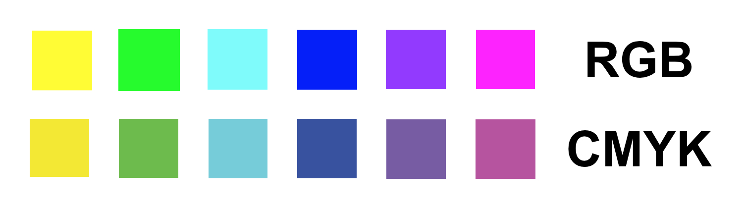
CMYK printing works by layering tiny dots of ink in varying percentages to simulate a wide range of colors. Because it relies on reflected light rather than emitted light, the color range of CMYK is smaller than RGB. Many colors visible on a screen simply cannot be reproduced accurately with ink on paper, such as bright neon colors, intense greens, and highly saturated blues.
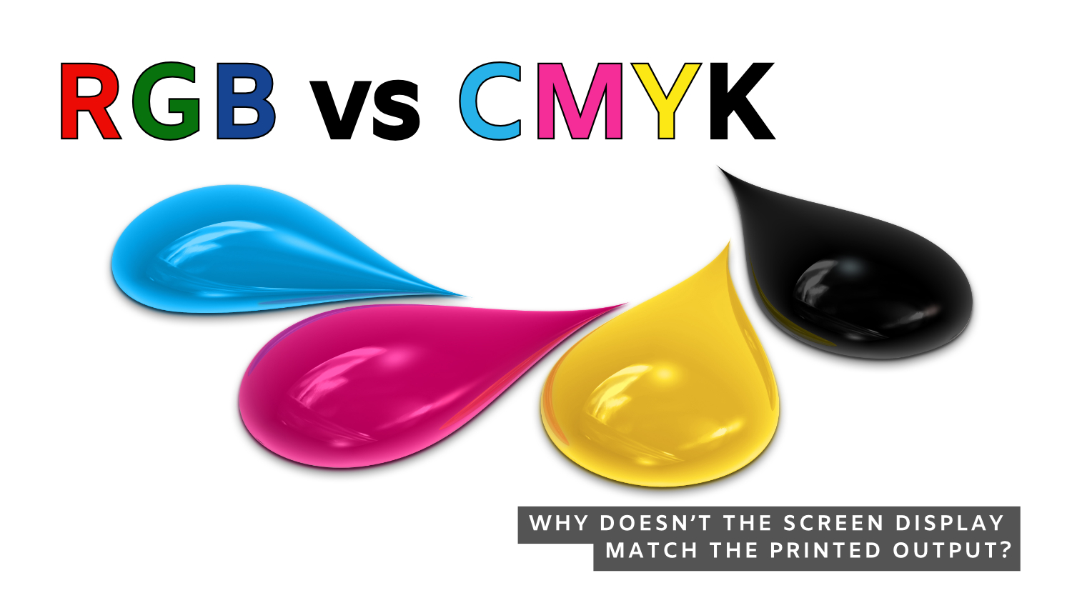
Why doesn’t the screen display match the printed output? This is one of the biggest frustrations for designers and here are some reasons why.
- Screens emit light while paper reflects light. A monitor naturally appears brighter and more vibrant than ink printed on paper.
- Monitors vary dramatically. Two different screens can display the same file differently depending on brightness settings, calibration, display technology, and ambient lighting. A designer working on an uncalibrated monitor may see colors that are wildly inaccurate.
- Paper stock also affects color appearance. Coated paper reflects ink differently than uncoated paper. A color printed on glossy stock may appear richer and more saturated than the same color printed on uncoated or textured paper.
- Ink density, press conditions, humidity, and finishing techniques can also influence final color output.
Designing in CMYK
Designing something that will ultimately be printed—brochures, business cards, packaging, signs, catalogs, or direct mail—design using the CMYK color system from the beginning. This choice enables you to make informed color decisions, prevent unexpected outcomes, and achieve more precise printed results.
Many designers create artwork in RGB because the colors look more exciting on screen. The problem occurs later when the file is converted to CMYK for printing. During conversion, colors outside the CMYK color range are automatically adjusted to the nearest printable equivalent. This frequently leads to muted or altered colors, along with disappointment that could have been prevented by designing with the final deliverable in mind.
NOTE: Designing in RGB is not something to shy away from. Its wide color gamut offers significant advantages. Once you are clear about the final deliverable, you can convert to CMYK when necessary and secure final color approval.
CMYK Swatch Book—an important design tool.
One of the best investments a print designer can make professionally is the purchase of a CMYK swatch book.
This book shows actual printed color samples rather than simulated colors on a monitor. Since print is the final medium, physical printed references are far more reliable than screen previews. When color precision is crucial, physical printed references, such as swatch books, serve as the industry standard.
Swatch books allow designers to:
- Select colors based on real printed output
- Compare coated versus uncoated paper appearance
- Understand how ink percentages affect results
- Communicate precise color expectations with clients and printers
Ready to get started? Contact us!
Econoprint offers both digital and traditional offset printing. Digital is perfect for high-quality, shorter print runs. Offset printing offers greater cost effectiveness for longer press runs. Contact us today and we can help you decide which is better for your printing needs.
Econoprint is a full-service commercial printer serving Racine and southeast Wisconsin with a complete range of services to cover every aspect of printed communication, from graphic design through printing, finishing, mailing, and fulfillment plus wide format output for signs, banners, and trade show materials.