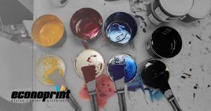
Control it with color.
by Samantha Repischak
Think of that cup of Starbucks coffee you had this morning. How about that McDonalds you passed by? Without giving much thought, you can probably picture the logo for these companies without much difficulty. If it’s the green of the Starbucks mermaid, or those golden yellow arches forming a recognizable m; most logos today rely heavily on the use of color to draw in customers to their brands and promote recall.
So how does this translate to commercial printing? The role of color for printed material can be particularly impactful – with the use of strong and vibrant colors standing out the most. Color can have an impact on not only the overall design but how customers react. It is essential to use color, but balance is key so the message doesn’t get drowned out. So how is this balance achieved? Simply through well thought out planning.
Our perception of an item can be altered based on what color is presented. Certain colors and various combinations elicit certain feelings on a psychological level. Even if they are just pretty to look at. For example, most fast food chains use a combination of reds, oranges, and yellows in their logos because those colors stimulate a feeling of hunger; which draws in customers, if not for the tasty smells of the food alone. Greens and browns gain the attention of the environmentally conscious individual, so messages like this should use these colors for the greatest impact.
Color is chosen for various reasons, each with a different meaning for each brand. According to an interview with previous CEO of Starbucks Howard Schultz, the green logo color in their 1987 redesign is meant to reflect the growth, freshness, uniqueness and prosperity of the company.
Additionally, a color scheme is key to supporting the “personality” of the brand that draws in your ideal customer. Blues may tie to calming feelings, the ocean, the sky, etc., or Reds reflecting heat, energy, and intensity. The combined look will form a pretty impactful print.
If one is looking to create an impactful print it comes down to the message itself. A strong message carries a print, while the color enforces the overall design. This creates a uniform look to the piece where all elements form a desired balance. It is easier to think of color as that ‘extra something’ your print may need to pop. Want to focus on a specific element? Use a color box or outline to draw attention to that section. Color is a vital element. The same could be said about the message and the overall design as well, so finding the right balance and combination of color imagery and design will make the print that much more impactful.
We are Racine’s printing and color experts. We know color. You know your clients. Let us work with you create visually stunning print designs to draw in the customers you want through splashes of color and other creative elements.

